
Graphical interface, software
Asus hasn’t been very good with its own GUIs. There was a less usable and even less spectacular Today plug-in on ZX1 and P320, and now this has been extended with… something… they call genial. The end result is quite disappointing, but I had some funny moments imagining the board meeting when they have come up with the whole thing:
- Have you guys seen HTC TouchFLO?
- Yeah, it’s really cool, we should have something like that.
- Okay Joe, go ahead and make one if you’ll have some free time in the lunch brake!
Okay, I’ve been very evil, but I think the process has been something similar, as the interface looks very lashed-together, it’s based on the “anything will do” principle, but probably no one has tried using it. No, I’m not saying this because it also looks rather ugly, but it’s another fact that one would expect some effects on such a handset.
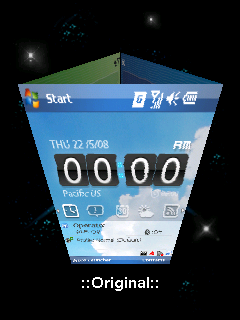
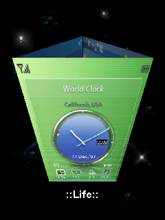
You can see the 3D part on the picture. The point is that we have three screens, all of them have a small thing that looks like a prism (right from free-icons-for-you), and upon touching this we can see the wonder from the image above, without any kind of transition or animation, but at least it’s fast. This can be scrolled horizontally and access the life and business views, which are almost the same as the default, just have different colors and the Start menu is inaccessible on them, which is a… not-so-great thing on a Pocket PC. The main screen displays the current time, missed events, calendar entries, weather forecast, our favorite RSS feeds and the music player via the icons; the life part also has an image viewer as a bonus, while at the business view we have another clock, which makes the music player disappear. So we have three screens with the same things on it, I don’t why is it done this way, I really had no motivation to switch to the life view to launch the music player when it’s available on the default screen. And now, I didn’t switch for the image viewer either, it’s available in the Start menu as well, and it’s only a click away. The whole thing is useless and meaningless, I would be ashamed to use it even in a freeware software.
Default and live views. Find the three differences!
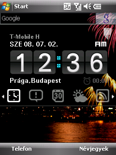
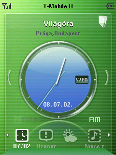
There is a bit more usable feature, which would be enough on its own, so it makes this Today-screen app become even more useless: it’s called AnyTime Launcher. This strange-looking quicklaunch interface with a logical layout can be accessed via the second hardware key and it lets us access settings, software, call-related stuff and multimedia contents. This includes the image viewer EziPhoto that can be controlled with gestures; zooming here is a bit hard, but it’s fast and has a nice animation. The launcher also has a calendar and an album view, switching to these has a cool effect, so I really can’t understand why did the Asus guys use such a shitty Today screen.
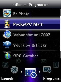
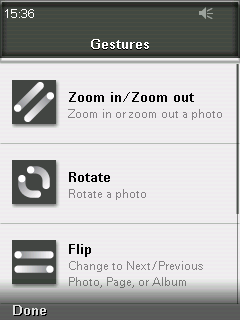
AnyTime Launcher and the image viewer’s help
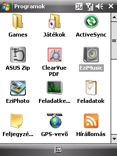
Let’s see the extra software. The Today has a Google search bar, while in the menu there is Asus Zip, a PDF reader, a task manager, an RSS reader, a Java runtime environment, a Backup software, a YouTube and Flickr uploader - no, there’s no media player.
A cikk még nem ért véget, kérlek, lapozz!


