
Hardware, menu, speed
It seems almost unbelievable, but Meizu is based on Windows. Of course it doesn’t have Windows Mobile, but the core is the same Windows CE kernel 6.0 (Yamakazi) that will be the foundation of Windows Mobile 7. The CE kernel is basically tasked with handling the hardware and resources, it has no graphical user interface, that has been done by Meizu and it’s called Mmobile GUI – I don’t if this has been a typo back then or did they really want to call it this way. The CPU is a 667 MHz ARM 1136JF-S, which is another new piece of hardware, Nokia 5630 XpressMusic will have a similar one, but that will tick at 600 MHz. The system memory is composed of 256 MB DDR SDRAM, and depending on the model we get 8 or 16 GB of flash memory for storage. As opposed to preliminary information there is no memory card expansion slot, or at least we didn’t find any.

The user interface is simply wonderful. It’s unbelievable that this is based on the CE kernel, as it’s fast, flexible and easy to use. My friend Bek has been happy to announce me after spending a couple of minutes with Meizu that if I don’t give a highly recommended award to this one, than the end of the world will come, as this is just as fantastic as the iPhone’s system. The truth is that it’s not that fantastic, as it’s basically just as fast and easy to use as the modified OSX on the great rival, but it can slow down a lot sometimes; after a long period of use it sometimes takes a couple of seconds to process taps and I have even seen some Chinese error messages. Yeah, Chinese is the default language on this sample, and although we can choose English as well, I have still seen eastern characters in a couple of submenus. I think this is due to the non-final software and now I promise our dear readers that we’ll check out Meizu again, in three months, when the final version is launched.
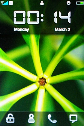
It’s not that clear on the picture, but Meizu’s display has a beautiful image quality
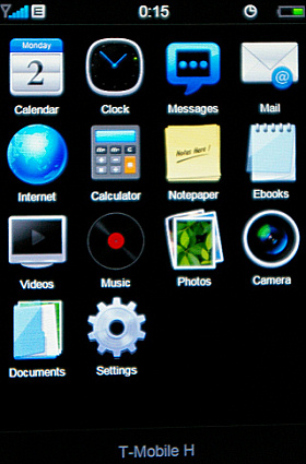
After turning on the handset we have to wait about a minute to get to the main menu, which is – how surprising – very similar to the iPhone’s menu. Of course there are some differences, the icons are not the same – many say that they don’t look that good, but I don’t think so – and the four icons from the bottom, permanently visible on the iPhone, are missing. Instead we can see the name our network operator and if touch it we get to the phone section, which includes the dial screen, the contact list, the call log and the call settings screen. The button on the bottom front is of course used for getting back to the main menu, there is no special animation here, but the process is quick enough to be seamless (theoretically there will be an animation as well in the new software version).
It seems that our Chinese friends didn’t want to make a 1:1 copy the idea of the screen lock, which had such a positive effect on them that they’ve made something even better. If we wake the phone up – with the power button or the button below the display – we get to see four icons on the bottom, and we have to drop them on the upper part of the screen. The stroke is similar, but the cool thing that there are four icons on the bottom, so by dropping the appropriate one we can get to the contact list, the dial screen or even to messaging. Let’s get back to the main menu a bit. There are 4 x 4 (haha) icons on a screen, but there are more screens and we can switch between them with our finger – iPhone-feeling? No wonder. I’ll tell you one more surprising thing: we can resort the icons by keeping our finger on the icon and than a frame appears around it.
A cikk még nem ért véget, kérlek, lapozz!


