
S-Class menu
LG Arena is the first phone to have the manufacturer’s own, completely redesigned menu system called S-Class UI. No, this is not an operating system, but a graphical interface and in the future it will appear on other models, so we’ll take a close look at it right now, as it’s really nice and complex.
Let’s start with a scenario when the “keypad” lock (which is rather a screen lock) is active. In this case, by pressing the power button on the top the display comes alive, and by long-pressing the unlock button on the bottom, it rotates and pops up one of the four dedicated screens. By the way we always get back to the same place where we’ve locked the screen, so if we’ve put the phone down when reading messages, we’ll get back right there.
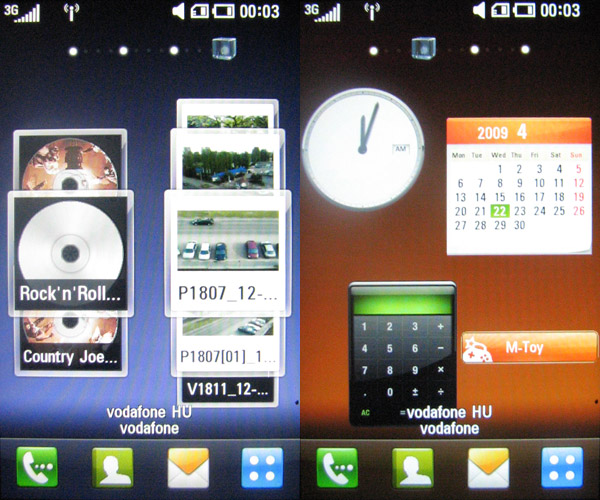
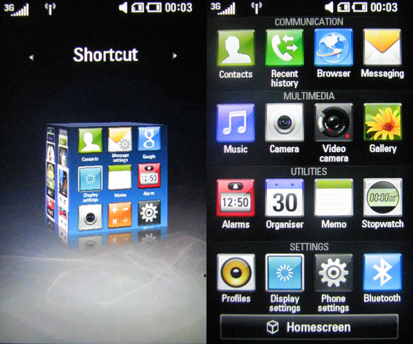
The menu system has two views, we first have the four dedicated screens I’ve mentioned, which are in fact the sides of a cube and we can switch between them by stroking the screen from left to right or from right to left. This is already cool, but we can spice it up even more by tapping the middle on-screen button, when the menu really becomes a cube that can be rotated and by tapping on a side we can select it and it will be displayed on fullscreen again.
The four screens have different things. We can place a total of nine icons (shortcuts) on the one with a bluish background, and practically we can put anything here. The one with the brown background is reserved for widgets, this can be scrolled vertically as well, and we can pull widgets on it from the bottom row. The green screen is for our favorite contacts, while the purple page displays selected multimedia contents. The contact list, messaging, the dialer and the menu’s icon is displayed on the bottom row of all four screens.
This cube with the rotation and everything is very fast. We can edit the screens by long-pressing a selected element and then the interface becomes editable. This was the thing I didn’t discover by myself and I needed the manual. We cannot only organize contents of the multimedia and the contact list panel like on the iPhone, but all the stuff is placed on a cool spindle, and we can spin it with a finger. It’s a cool, well though-out system, but this is not all, as I didn’t mention the main menu yet.
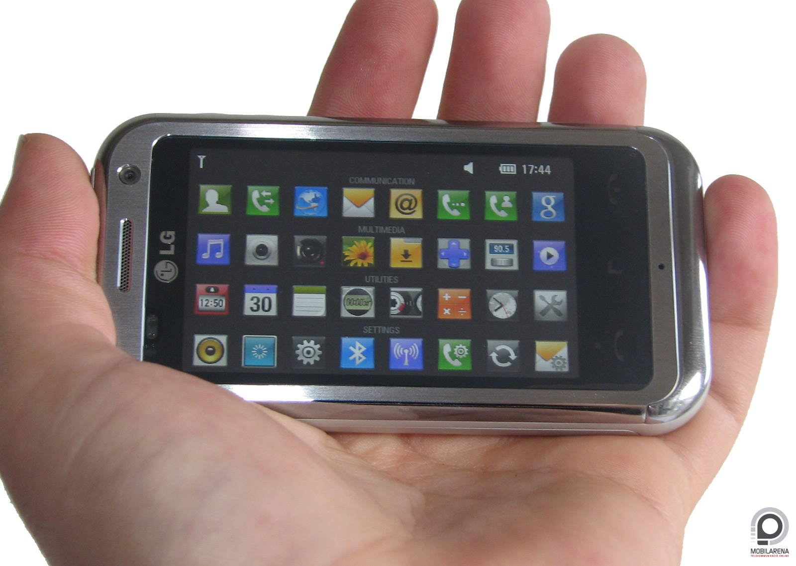
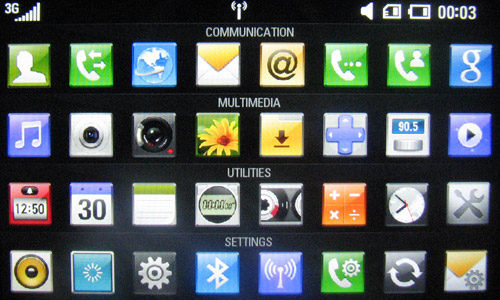
The main menu is completely new. 16 icons are displayed at a time, arranged in four rows. But – and this can be seen through a small shake-like animation as soon as we enter the menu – we can pull the rows with our finger, so we can see four additional icons per row. It’s a really thoughtful thing, I’ve been absolutely astonished. And that’s not the end: the phone’s gyroscope makes it possible that by rotating the phone, all icons are displayed on-screen (even though in a smaller size); this looks awesome.
A cikk még nem ért véget, kérlek, lapozz!


