
Menu, usability
I have personally had great expectations of the new TouchWIZ user interface. There are no logical problems with it, there are tons of new widgets available, finally the main screen can be scrolled vertically as well, so we can put lots of widgets there, we should just keep in mind where did we place them. When pulling the screen to the side we get to the menu, everything has some small animation, which finally doesn’t lag. If we pull our finger to the other direction we get to the contact list with pictures.
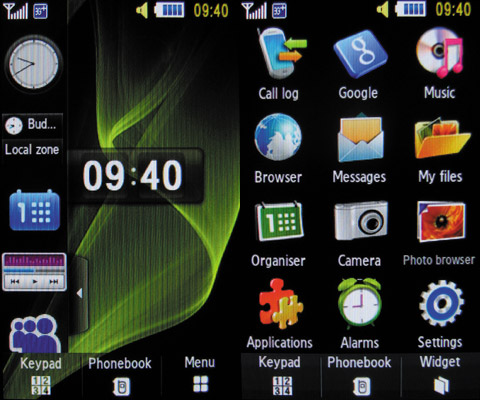
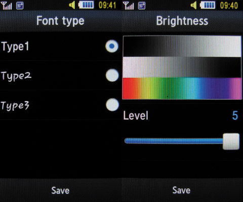
The main menu has 12 icons. There’s no use looking for the contact list over here, that’s on the bottom in the center, so we could say that we have 13 ways to go to from here. Customizability is quite poor, we can’t change the icons, or the wallpaper behind the menu, there are no themes. The order of menu items cannot be changed, we can’t switch from grid to list view, but we can choose from three fonts.
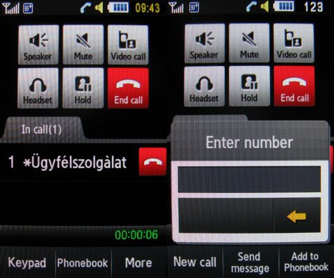
The in-call screen looks quite cool and the most important features (contact list, handsfree) are just a click away (except the voice recorder), and the system even allows us to send an SMS during a call. The light sensor above the secondary camera sees if we put the handset to our ear and turns the backlight off and the “keypad” lock on.
Scrolling, however, is still problematic. It’s not even close to an iPhone, a Meizu or a HTC, it’s stuttering and you never know if you’ve scrolled enough. It’s not such a big deal when getting around the contact list, as the numeric keys can be used for searching. But when browsing the web, or reading messages this algorithm proves to be a very basic one. Of course if you’ve never seen anything better than it does the job, but the best deal would have been to put a real scrolling wheel on the phone.
A cikk még nem ért véget, kérlek, lapozz!


