Menu
The display looks nice, but it's a bit small. This might be why the 320 x 240 pixel resolution has an extremely sharp image. The menu is, hmm, strange. There is only one theme by default, this has red and white colors on black, which is no problem, but there could have been more of them. Much more could be produced from this ROKR design.
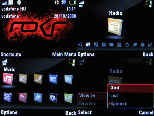
The system's logic, however, is really strange in lots of places. The main menu has ten icons, these can displayed in a list, grid (two lines) or a roundabout view. This last one is quite spectacular and even though, due to linearity of the layout, it theoretically takes more time to access functions in the middle, usability is not slown down. Still, the order of the icons can be changed, so we can put the SongID music recognizer somewhere in the end for example. Let's see a video of the basic functions and the box:
It's really annoying that functions are assigned randomly to the center of the navigation key (the OK button). This means that where it has a function it is indeed used as OK, and this is logical, but there are places where it doesn't do anything. For example we have this situation after reading an SMS: for me it would be logical to have the OK key show the reply/forward/delete options, but no, we have to press the function key below the options label in order to do this. Strangely it happens sometimes that before entering the main menu we get to see a “Please wait” sign, and this is no good thing.
A cikk még nem ért véget, kérlek, lapozz!


