

Speed, exterior
It might be needless to say, but I would like to draw everyone’s attention on the fact that the features discussed in this article are not constant or device-independent. The phone used for discussing the features was a 6300, as features in this model are usually present in other phones too. I would also like to make it clear that the article is possibly incomplete, but it includes the most important and useful functions.
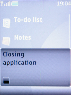
Usually there is a wait when launching or closing programs
Let’s begin with speed. Although there are differences between phones even in this matter, but we can declare Series 40 a fast, even if not the fastest, system, the only exception being Java-based software, there are usually a few seconds of wait when opening or closing these applications. The tendency shows that low-end models (those with a 128 x 160 display) are usually a bit slower, but this is no rule of thumb.
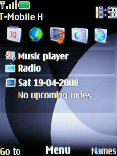
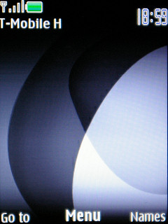
With and without active standby
Using these phones is very user-friendly. On the bottom of the standby screen there are three labels, the one in the middle is for the action button of the d-pad/joystick, the ones on the sides can be activated with the function buttons. The latter ones can be changed by the user, but the one in the center will take us into the menu for sure. The previously mentioned active standby is a very useful function, this puts a series of quick launchers on the “desktop”. Many people only put shortcuts for programs, but we can even use a music player controller or even a calendar. Another function that eases use is that we can assign actions to the four directions of the navigation control. The numeric keys and the voice command software can be used for speed dialing.
Grid and tabbed layout
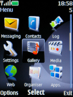
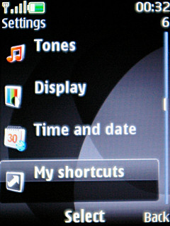
The menu’s view can also be changed. The icons are arranged in a grid by default, we can see 3 x 3 or 3 x 4 icons on-screen, the latter being the case when we disable the labels. We can set a list or a tabbed view too, the latter one shows the menu icons on top of the screen (five at a time) and we can browse them horizontally, but we can see the functions inside them in the bottom in a list, so we can spare an unneeded press of a button, as we don’t have to enter a submenu to access the functions inside it. The sequence of the icons can be freely set and we can quickly access the menu items by pressing the numeric keys. Pressing the call rejection key takes us to the standby screen, no matter where we were before.
Submenus
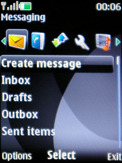
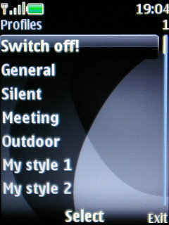
One of the most objectionable part of the system is the way the submenus look, more precisely the layout’s use of space. On smaller screens we can see 2, say two rows at a time, and twice as much at QVGA resolution. This, unfortunately, is not set this way to enhance readability, as the labels are not large, only the icons take up a lot of space. In case of lists without icons (the profile selector for example) the situation is much better, we can see seven rows on a large screen.
Adjustable font size, help
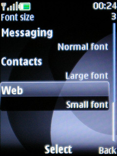
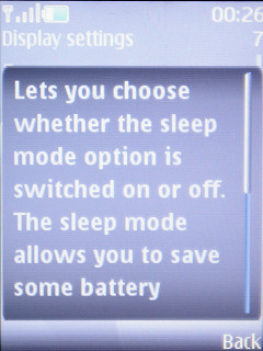
There are no problems with customizability. With the use of themes we can completely change how the system looks, and this includes icons too, not just the background. We can set the font size of certain text areas (messaging, contacts, web), but the colors is defined by the theme, we can only adjust this for the standby screen. The built-in help is a useful feature, keeping a certain element selected for a short time makes the appropriate description appear.
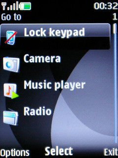
”Go to” quicklaunch menu
If we still would be in trouble with launching programs, then we can define a quicklaunch menu that can be assigned to one of the software keys. Fortunately we can only say positive things about the layout of menu items, as it is logical, everything’s where it should be and finding a certain setting doesn’t cause any trouble even to inexperienced users.
A cikk még nem ért véget, kérlek, lapozz!


