

The unique user interface
As all Windows Mobile users know, the operating system isn’t very user-friendly by default, at least in terms of usability. Of course the manufacturers know this as well, so all have their own user interfaces, which usually come in the form of Today plugins and other features. The best job has been done by HTC, as TouchFLO 3D doesn’t only look good, but it’s also fast and easy to use. Of course Xperia doesn’t have this, but as a matter of fact it doesn’t have any kind of Today plugin, as the manufacturer had a different strategy: they give us more Today screens. Seven in total, and we can switch between these with the key labeled X-Panel - switching is darn slow.
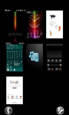
So we can access the screen above by pressing this button, and then there comes two-three seconds of wait. It has an effect that might even be called cool, but this is not the first thing that pops into our mind since it’s slow. As you can see we can have at most nine screens displayed on a page and there is another view for poker players, as in that case the Today screens are arranged similarly to the cards in our hands. If we don’t choose any of them, the icons start wobbling, at least this looks cool, not like the screen changes, as the manufacturer used an easy to spot trick: after we tap the picture we want, we first get an image which changes to the effective screen after some loading and hourglass-watching. The switch can be seen by the image becoming sharp. I can’t say anything else than this is lame.
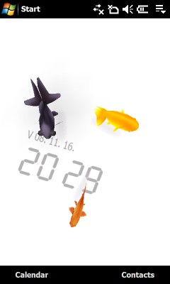
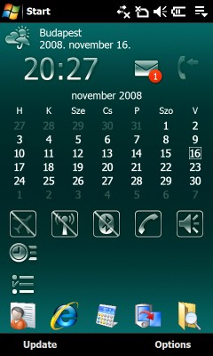
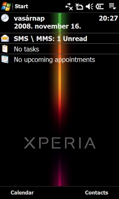
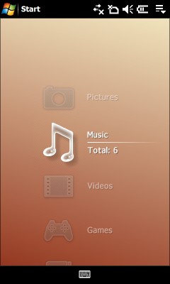
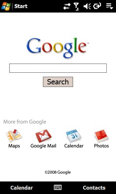
The first layout could be called the standard Windows Today; here we can put any number of plugins. The second one has a large clock and a couple of shortcut icons; this will be preferred by those who are always running late. The third one is one of the most dumbass things I’ve ever seen: there is a white screen with three fishes on it, which can teleport, since after switching to this view they are fist standing in one place (preloaded picture, you know…) and then they suddenly change position and start swimming around. All they know is to follow our finger as we start moving it around the screen, well this is indeed awesome, I think this is clearly a nomination for the “Screensaver of the Year” award… oh, or maybe not, this has been already won back in the ‘90s when Windows 3.1 has been the top. The fourth layout might be the favorite of businessmen with a calendar and shortcuts; this is quite easy to use. The layout sitting in the center is reserved for multimedia contents, it has the usual Sony Ericsson menu, this is where we will play back our music and we will also be browsing images over here – of course only after we wait four-five seconds for it to load. The sixth icons if of the radio’s, the seventh is owned by Google, it has search and four shortcuts. We can access the Start menu and the taskbar from all view, at least this is positive.
The only advantage is that we can see HTC’s work at some parts. For example the X key has some features made by them, so one hand it really closes programs and on the Today screen it opens up the list of applications – unfortunately taskbar icons are the default ones, so they won’t get bigger if we tap near them. The Comm Manager is also made by the Taiwanese guys, and I think that the scrolling routine is from them as well. There is no gyroscope in the phone, the screen rotates when we open the phone, but of course this is a bit slow as well.

I had the German handset for testing, which had a wonderful T-Mobile logo in the background. This also means that instead of the Google panel I had the web’n’walk interface, probably the other network operators will also use a similar method to customize the Xperia menu. I think that these seven skins are surely great, but none of them can fulfill the function that is one of the most important qualities of all current touchscreen handsets: it’s easy to navigate on them without a stylus. It might be strange to say this, but the screen resolution makes things even worse, for example it’s impossible to hit the proper letter of the alphabet on the side of the phonebook without a stylus, but sometimes it’s even hard to scroll the Start menu down, this can be seen on the video on the previous page. User experience has been the slogan, but I think this has been more like marketing gibberish instead of experience. A couple of skins look cool, but they don’t enhance WM’s stylus-optimized interface. Omnia, or a TouchFLO system are much better, complex and easier to use than this.
A cikk még nem ért véget, kérlek, lapozz!


